The first chart is a graph of the amount of money the Federal reserve lent to banks per year. As you can see this lending peaks in the 80's at nearly 8 Billion per year.

This second chart is the same graph on a new scale to fit the most recent federal reserve activity. Notice how you can't even see the bumps when we include this years lending topping out at over 600 billion.
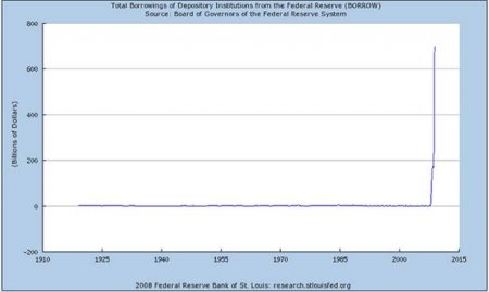 Hats off to East Coast Economics; they published these graphs. Original article can be found here. Thought this would be interesting to share to help put a little perspective on what we are going through. Remember the Federal reserve is suppose to be the "lender of last resort." Right now banks can get money from the fed for 0.00% interest and then deposit it back with the Fed and earn .25% interest.
I promise I will get back to making posts I had originally planned when I started the blog but keeping up with the most recent economic news has kept me pretty busy and it's just too important to completely ignore.
TRC


No comments:
Post a Comment